Barndominiums have taken the housing world by storm, combining rustic charm with modern flair. While their open floor plans and durable metal structures make them highly practical, there’s another element that can truly set them apart: color. In a world where barndominiums are often seen in neutral tones or traditional farmhouse palettes, bold and unexpected color schemes can make a stunning impact.
If you’re designing or renovating a barndominium and want to break away from the ordinary, this post explores how to use color creatively to transform both exterior and interior spaces. We’ll cover trends, design principles, and real-world examples to inspire a barndo that’s anything but basic.
Why Go Bold with Color?
Color is one of the most powerful tools in design. It influences mood, creates atmosphere, and defines the character of a space. For barndominiums, which already bend the rules of traditional residential architecture, bold color schemes offer a way to further personalize and modernize the aesthetic.
Unexpected color choices can:
- Highlight architectural features
- Create visual interest and curb appeal
- Reflect the owner’s personality
- Enhance mood and functionality of interior spaces
- Set your barndo apart in a crowded design landscape
Exterior Color Ideas that Ditch the Default
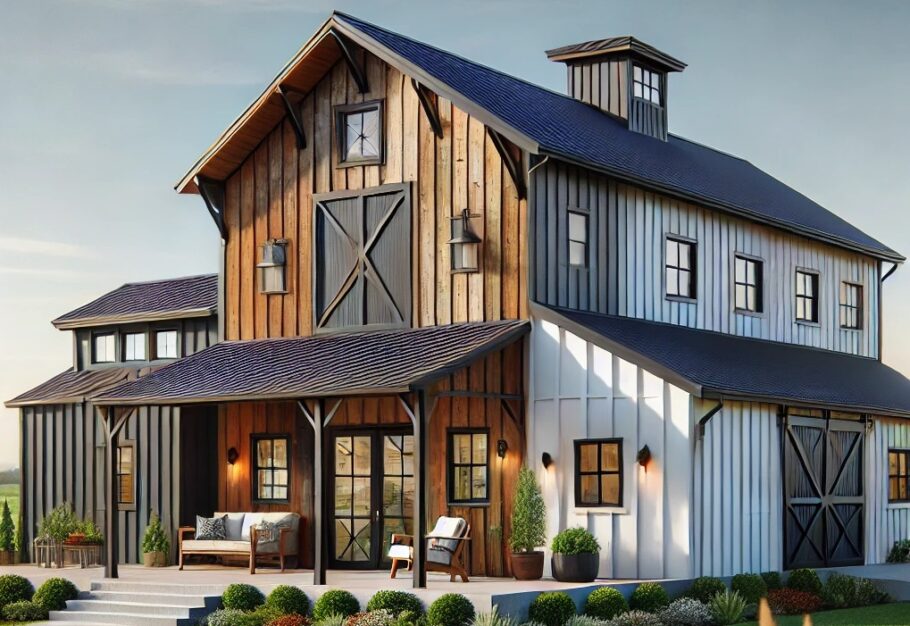
Most barndominium exteriors are finished in black, white, gray, or barn red. While these classics have their place, experimenting with color can turn your home into a visual landmark.
- Teal and Charcoal
Combining deep teal siding with charcoal trim gives your barndominium a modern yet inviting look. Teal adds a coastal, nature-inspired vibe, while charcoal keeps the palette grounded and sophisticated.
- Mustard Yellow with Black Accents
Mustard yellow is warm, earthy, and bold. Paired with black doors, windows, and roofing, it strikes a balance between quirky and refined. This color scheme works particularly well in rural landscapes with natural backdrops.
- Deep Plum and Cream
Plum may seem unconventional for an exterior, but it radiates richness and creativity. Soft cream trim helps lighten the look, making it feel luxurious rather than overpowering.
- Sage Green and Copper
Sage green is subtle enough to blend into natural surroundings, yet distinct enough to stand out. Paired with copper roofing or accent trim, this color duo feels organic and elegant.
- Cobalt Blue and White
For those who want a nautical or Americana twist, cobalt blue with white trim delivers high contrast and high energy. It’s cheerful, eye-catching, and perfect for barndos in coastal or lakeside locations.
Interior Color Strategies That Surprise
Interiors are where color can really play. Unlike traditional homes, barndominiums often feature open spaces, high ceilings, and industrial materials. These features provide the perfect canvas for dramatic or playful color.
- Bold Color Blocking
Instead of painting an entire room a single color, consider color blocking with two or more bold hues. Think emerald green and navy blue in a living space, or terracotta and blush pink in a kitchen. This approach creates zones, adds depth, and turns walls into works of art.
- Black Walls
Though not for the faint of heart, black walls can be stunning in a barndominium’s large open spaces. Matte black can add depth and drama, especially when paired with light wood flooring, brass fixtures, or natural light.
- Jewel Tones in Unexpected Places
Add sapphire blue to ceilings, ruby red to an accent wall, or amethyst purple to a powder room. Jewel tones are rich, luxurious, and bring a level of sophistication to otherwise minimal spaces.
- Earth Tones with a Twist
Olive green, burnt orange, ochre, and rust are all earthy hues that feel grounded and cozy. Mix them in unconventional combinations—like pairing rust with lavender or ochre with slate blue—to keep things interesting.
- Pastels with Punch
Pastels aren’t just for nurseries anymore. Modern pastels, such as dusty mint, pale apricot, and smoky lilac, bring calm and character. Layer them with bold trim, graphic art, or industrial textures for contrast.
How to Choose the Right Bold Colors
Going bold doesn’t mean going random. Here are some design principles to guide your choices:
- Context Matters: Consider your barndominium’s location, natural surroundings, and existing features.
- Balance Bold with Neutral: Too much intensity can overwhelm. Pair vivid colors with white, beige, or gray for visual relief.
- Test Before You Commit: Paint large swatches and view them in different lighting before finalizing.
- Start Small: Try bold colors in smaller spaces (like a powder room or mudroom) before using them in large areas.
- Get Inspired: Look to art, fashion, nature, and other cultures for color combinations that feel fresh and exciting.
Final Thoughts
Color is your barndominium’s secret weapon. While structure and layout provide the bones, color gives it soul. Choosing bold and unexpected color schemes allows you to express personality, break norms, and design a space that feels uniquely yours.
Whether you’re building from the ground up or refreshing an existing barndo, don’t shy away from making a statement. Bold doesn’t mean chaotic—it means confident, intentional, and inspired.
So take the leap. Go for that mustard yellow, that emerald green, or even that matte black. Your barndominium deserves to stand out.