
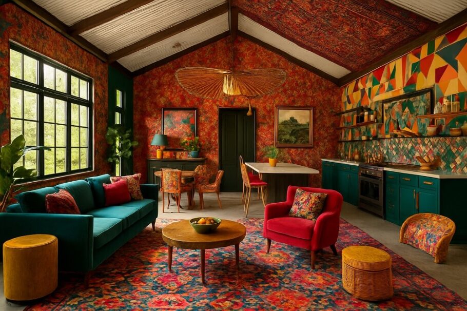
The barndominium has evolved far beyond its humble agricultural roots. What once served as a simple metal shell for housing both livestock and living quarters has transformed into a blank canvas for architectural expression. Among the most striking trends emerging in this space is the use of bold, geometric color blocking on exterior surfaces. This isn’t just about picking a front door color anymore; it’s about fundamentally reshaping how these structures are perceived through the strategic application of paint.
More Than Just a Coat of Paint
Color blocking on a barndominium serves a purpose that extends well beyond aesthetic appeal. The practice involves dividing the exterior into distinct geometric sections, each receiving a different, often contrasting, color. This technique can visually break up the massive expanses of metal siding that characterize these buildings, adding depth, dimension, and a sense of intentional design.
The effect can be dramatic. A long, horizontal barndominium might appear more grounded and stable with a darker color applied to the lower third, visually anchoring it to the earth. Taller structures can benefit from vertical color blocks that draw the eye upward, emphasizing height and creating a more commanding presence. The geometry of the color application works in concert with the building’s existing lines to create a cohesive, thought-out design.
The Psychology of the Palette
Selecting the right palette for a color-blocked barndominium requires careful consideration of the desired emotional impact and the surrounding environment.
Deep, moody tones like charcoal, forest green, or navy blue lend a sense of sophistication and permanence. These colors work exceptionally well in rural or wooded settings, allowing the structure to recede slightly into its natural backdrop. When paired with warmer wood accents, the result is a modern yet approachable farmhouse aesthetic.
High-contrast combinations are where color blocking truly shines. Pairing a crisp white or light gray with a bold accent like burnt orange, mustard yellow, or teal creates visual tension. This approach transforms the barndominium from a simple outbuilding into a deliberate architectural statement. Such bold choices often work best in more open landscapes where the structure stands as a focal point.
Monochromatic schemes offer a more subtle approach. Utilizing varying shades of a single color across different sections provides depth and interest without the stark contrast of a multi-hued palette. This strategy can highlight the building’s architectural features while maintaining a clean, cohesive look that won’t quickly feel dated.
Addressing the Practicalities
The romance of a bold color scheme must be balanced with practical considerations, particularly when dealing with metal siding. The choice of paint is not merely decorative; it is protective.
High-quality, exterior-grade acrylic paint formulated for metal is non-negotiable. This type of paint offers superior adhesion and flexibility, crucial for withstanding the expansion and contraction that metal undergoes with temperature fluctuations. Proper surface preparation is equally critical. Metal panels must be thoroughly cleaned and primed to ensure the bold new colors don’t peel, fade, or flake prematurely.
The architectural lines of the building itself should dictate the color blocking strategy. The seams where metal panels meet, the corners of the structure, and the roofline all serve as natural boundaries for color transitions. Working with these existing lines, rather than against them, creates a cleaner, more professional finish. Attempting to force a color change in the middle of a panel, without a clear architectural break, can appear sloppy and undermine the entire design.
Beyond the Obvious: Accents and Trim
A successful color-blocked design looks at the whole picture, not just the main wall sections. The trim, fascia, and window frames are often neglected, yet they offer a prime opportunity to either reinforce or play against the main color scheme.
Using a consistent accent color on all trim elements—like window casings and corner boards—can unify the entire design. On a building with three distinct wall colors, a single trim color used throughout provides a visual thread that ties the sections together. Conversely, a subtle shift in the trim color in one section can help define that geometric block even further, adding another layer of sophistication to the overall composition.
The roof is another crucial element. While it may seem a permanent decision, the roof color interacts directly with the new paint scheme. A dark roof against a light-colored upper block will create a distinct line, while a lighter roof can help a darker upper section feel less heavy.
Making the Statement
Color blocking on a barndominium is a design decision that cannot be reversed with a simple thought. Once the paint is applied, the statement is made. For those considering this bold move, the process is best approached with a clear vision.
Creating a simple elevation drawing and experimenting with digital color renderings can save significant time and money. This planning phase allows for an honest assessment of how different geometric divisions and color combinations will look on the actual structure. Considering the building’s orientation to the sun is another key factor; a color that looks striking in the showroom may appear entirely different under the harsh midday sun versus the soft light of evening.
When executed thoughtfully, the color-blocked barndominium achieves a remarkable feat. It takes a structure rooted in function and elevates it to a work of art, a beacon of personal style that stands confidently against the horizon. The result is not just a home, but a conversation piece, a testament to the power of color and geometry to transform the ordinary into something truly exceptional.