Barndominiums are celebrated for their versatility, blending the rugged efficiency of agricultural structures with the comfort and customization of modern homes. While structural design, layout, and materials often take center stage, paint palettes play an equally important role in defining the personality, comfort, and long-term appeal of a barndominium. The right paint colors can visually expand space, balance industrial and residential elements, improve lighting efficiency, and even enhance durability in challenging climates.
Unlike conventional homes, barndominiums combine metal, wood, concrete, and open-plan interiors. This unique mix requires a thoughtful approach to color selection that accounts for texture, light reflection, scale, and function. In this guide, we explore how to choose paint palettes for barndominiums, covering exterior and interior strategies, popular color families, regional considerations, and practical tips to ensure your palette remains timeless and functional.
Why Paint Palettes Matter in Barndominiums
Paint is more than a decorative finish. In a barndominium, it serves both aesthetic and practical purposes. Because many barndominiums feature large wall surfaces, high ceilings, and exposed structural elements, color choices are amplified. A poorly chosen palette can make spaces feel cold, cavernous, or overly industrial, while a well-designed palette can bring warmth, cohesion, and balance.
Exterior paint colors affect curb appeal, heat absorption, and how the building blends with its surroundings. Interior colors influence mood, perceived temperature, spatial flow, and how different materials interact visually. Since barndominiums often emphasize long-term durability and low maintenance, paint selection must also consider fading, staining, and compatibility with metal and wood substrates.
Understanding the Barndominium Aesthetic
Before selecting a paint palette, it’s important to understand the core aesthetic of a barndominium. Most barndominiums fall into one or more of the following design categories:
Modern industrial with clean lines, neutral tones, and minimal ornamentation
Rustic or farmhouse-inspired with warm neutrals, earth tones, and natural textures
Contemporary rural blending bold accents with neutral foundations
Transitional designs combining modern simplicity with traditional comfort
Your paint palette should reinforce the chosen aesthetic rather than compete with it. Consistency between exterior and interior colors also helps create a cohesive experience from the moment someone approaches the building.
Exterior Barndominium Paint Palettes
The exterior palette sets the tone for the entire structure. Because barndominiums often use metal siding, paint colors must be selected with durability, sun exposure, and environmental context in mind.
Neutral Exterior Palettes
Neutral palettes are the most popular choice for barndominiums due to their timeless appeal and compatibility with metal structures. Shades of white, off-white, gray, taupe, and beige provide a clean canvas that highlights architectural lines without overpowering them.
White and light gray exteriors are especially effective at reflecting sunlight, reducing heat gain in warmer climates. When paired with dark trim or black-framed windows, these palettes create a crisp, modern farmhouse look. Warmer neutrals such as greige or sand tones work well in rural or wooded settings, helping the building blend naturally with its environment.
Dark and Moody Exteriors
Darker paint palettes have gained popularity in modern barndominium design. Charcoal, deep gray, matte black, and dark bronze create a bold, contemporary statement. These colors emphasize the industrial roots of the structure while adding sophistication.
Dark exteriors work best when balanced with lighter trim, wood accents, or contrasting roofing. They are particularly striking in open landscapes where the structure becomes a focal point. However, darker colors absorb more heat, so proper insulation and reflective coatings are essential, especially in hot regions.
Earth-Toned Palettes
Earth tones connect the barndominium to its surroundings. Colors like olive green, clay, rust, brown, and muted blue-gray work beautifully in rural, agricultural, or mountainous settings. These palettes are ideal for homeowners who want their barndominium to feel grounded and organic rather than starkly modern.
Earth-toned exteriors often pair well with stone bases, timber porches, and metal roofs in complementary hues. The key is selecting muted versions of these colors to avoid visual heaviness.
Interior Barndominium Paint Palettes
Interior paint palettes must address scale, light, and the mix of materials typically found in barndominiums. Open floor plans and high ceilings mean that color transitions should be intentional and harmonious.
Light and Airy Interior Palettes
Light-colored interiors are a natural fit for barndominiums. Whites, soft creams, pale grays, and light beige tones enhance natural light and prevent large spaces from feeling overwhelming. These palettes are particularly effective in open-plan living areas where walls flow seamlessly into one another.
A monochromatic light palette doesn’t have to feel boring. Subtle variations in tone, combined with texture from wood beams, concrete floors, and metal accents, create visual interest without clutter.
Warm Neutral Palettes
Warm neutrals bring comfort and balance to the industrial elements of a barndominium. Colors such as taupe, warm gray, mushroom, and soft tan soften metal surfaces and exposed steel while complementing wood features.
These palettes work especially well in bedrooms, living rooms, and family spaces where a cozy atmosphere is desired. Warm neutrals also age well, maintaining appeal even as décor styles evolve.
Industrial-Inspired Palettes
For homeowners who want to lean into the industrial heritage of barndominiums, industrial-inspired palettes are a strong choice. Shades of concrete gray, steel blue, charcoal, and muted black echo the materials used in the structure.
To avoid a cold or stark feel, these colors should be balanced with warm lighting, natural wood finishes, and lighter accent walls. Industrial palettes are well-suited for kitchens, workshops, home offices, and loft spaces.
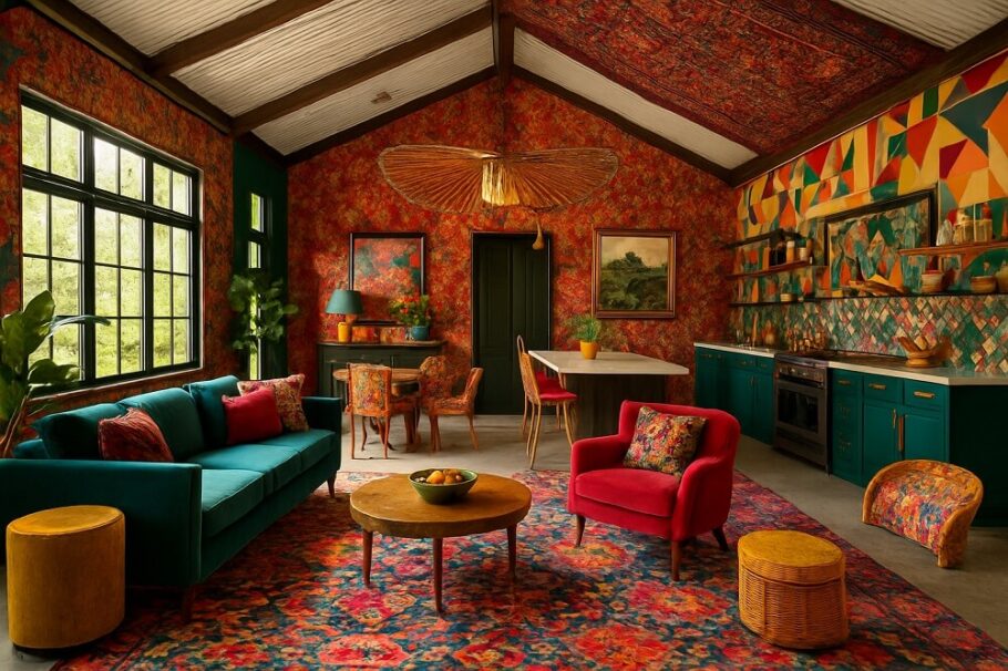
Accent Colors in Open Spaces
Accent colors play a crucial role in large barndominium interiors. Because walls often span long distances, accent colors help define zones without the need for physical partitions.
Muted blues, sage greens, terracotta, and deep navy are popular accent choices. These colors add depth and personality while maintaining harmony with neutral base palettes. Accent walls, painted ceilings, or colored doors are effective ways to introduce color without overwhelming the space.
Coordinating Paint with Materials
One of the most important aspects of barndominium paint selection is coordination with existing materials. Paint should complement, not fight against, metal siding, exposed beams, concrete floors, and wood paneling.
Cool-toned paints pair well with brushed steel, galvanized metal, and polished concrete. Warm-toned paints enhance the richness of wood and soften raw metal edges. When in doubt, test paint samples next to actual materials under natural and artificial light to see how they interact.
Regional and Climate Considerations
Climate plays a significant role in paint palette decisions. In hot, sunny regions, lighter exterior colors reduce heat absorption and slow fading. UV-resistant coatings are essential to maintain color integrity over time.
In colder or overcast climates, darker or warmer tones can make the structure feel more inviting and visually grounded. Interior palettes may also lean warmer to counteract limited natural light.
Dust, humidity, and precipitation should also be considered. Mid-tone colors often hide dirt better than very light or very dark shades, reducing maintenance demands.
Timeless vs Trend-Driven Palettes
While it’s tempting to follow current color trends, barndominiums are often long-term investments. Timeless palettes provide flexibility as interior décor, furniture, and finishes change over time.
Neutral foundations with interchangeable accent colors offer the best balance. This approach allows homeowners to refresh the look periodically without repainting the entire structure. Trend-driven colors can still be used strategically in smaller areas where updates are easier and less costly.
Practical Tips for Choosing the Right Palette
Always test paint samples in different lighting conditions, including morning, afternoon, and evening light
Consider sheen levels, as flat, satin, and semi-gloss finishes reflect light differently
Use consistent trim colors throughout the interior to create visual continuity
Coordinate exterior colors with roofing, doors, and window frames for a unified look
Balance bold colors with neutral anchors to prevent visual overload
The Role of Paint in Long-Term Value
Paint palettes influence not only daily enjoyment but also resale value. Thoughtful, cohesive color schemes appeal to a wider range of buyers and help a barndominium feel move-in ready. Well-maintained paint also protects surfaces from corrosion, moisture intrusion, and wear, extending the life of both metal and wood components.
Investing time in palette selection upfront reduces the likelihood of costly repaints and ensures the barndominium remains visually relevant for years to come.
Conclusion
Barndominium paint palettes are a powerful design tool that shapes how the structure looks, feels, and performs. By understanding the unique characteristics of barndominiums and choosing colors that complement materials, climate, and lifestyle, homeowners can create spaces that are both striking and livable.
Whether you prefer light and airy interiors, bold modern exteriors, or warm rustic tones, the key lies in balance and intentionality. A well-chosen paint palette enhances the architectural strengths of a barndominium while providing comfort, efficiency, and timeless appeal.