
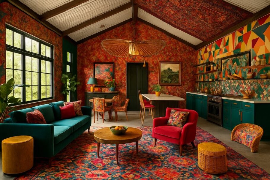
Barndominiums occupy a unique space in residential architecture. They blend the rugged utility of agricultural buildings with the comfort and polish of modern living spaces. For years, the default aesthetic leaned heavily on white, gray, and greige—safe choices that mirrored the “modern farmhouse” trend. However, a barndominium’s vast walls and open interiors offer a canvas too expansive for timid design.
Bold color is making a comeback in these structures. The key is balancing vibrancy with the industrial and rustic roots of the building style. The following palettes move past the neutrals to create exteriors and interiors that demand attention while maintaining structural integrity.
Exterior Color Schemes That Make a Statement
The exterior of a barndominium is typically defined by large expanses of siding, a prominent roofline, and often, a lack of traditional architectural detailing like shutters or ornate trim. Color becomes the primary tool for creating depth and interest.
Midnight Blue and Cedar
Dark, saturated blues—think navy or midnight—have a striking presence against a rural backdrop. When paired with natural cedar accents, the combination creates a sophisticated contrast. The cool tone of the blue siding prevents the wood from feeling overly rustic, while the cedar adds warmth that a monochrome blue would lack. This works exceptionally well when the cedar is used for porch posts, garage doors, or a gable accent. The result is a modern, tailored look that still respects the agricultural silhouette.
Charcoal and Copper
There is a reason charcoal is gaining ground on white. It absorbs light and makes a building feel grounded. To prevent a charcoal barndominium from looking like a monolithic block, copper accents offer a luxurious counterpoint. This does not require full copper roofing. Small details—copper gutters, downspouts, or a copper-clad front door—develop a patina over time that adds character. The deep gray serves as a neutral backdrop, allowing the warm, metallic tones of the copper to pop. This palette feels industrial yet refined, perfectly suited for a modern barndominium.
Deep Forest Green and Stone
For a property surrounded by trees or open fields, a deep forest green exterior allows the structure to nestle into the landscape rather than fight it. The risk with green is that it can feel flat. Incorporating a stone wainscoting or stone column bases in shades of gray and tan breaks up the color and adds textural contrast. The green should be dark enough to read almost black in shadow, giving the building a chameleon-like quality throughout the day.
Interior Palettes with Unexpected Depth
Inside a barndominium, the open floor plan often means the kitchen, living, and dining areas share the same visual field. A bold color choice in one zone must harmonize with the others.
Black Interior Doors and Warm White Walls
This is a high-contrast approach that respects the open nature of the barndominium. Painting walls a warm, creamy white (avoiding stark cool whites) keeps the space feeling airy. The drama comes from the doors and trim. Painting all interior doors matte black creates a graphic, intentional look. It draws the eye and breaks up long sightlines. This palette allows furniture and art to serve as the color focal points without competing with the architecture.
Moody Kitchen Cabinetry
The kitchen is where color can be most impactful. Instead of white shaker cabinets, consider deep olive, slate blue, or even a burgundy. Because barndominium kitchens often feature large islands, a two-tone approach works well. Choose a bold color for the perimeter cabinets and a contrasting neutral for the island, or vice versa. Pairing deep green cabinets with brass hardware and a white backsplash creates a space that feels both vintage and current. The key is ensuring the lighting is sufficient; dark cabinets absorb light, so layered lighting (pendants, under-cabinet, recessed) is essential.
The Accent Wall Reimagined
In a barndominium, the “accent wall” is not just a single wall in a bedroom. It can be the towering wall behind a loft, the chimney breast of a fireplace, or the wall behind a freestanding tub. Using materials like black corrugated metal, reclaimed wood in a dark stain, or a deep textured wallpaper creates a focal point. When using a bold material, keep the surrounding walls quieter to let the texture and color breathe.
Balancing Boldness with Livability
Bold does not mean chaotic. A few principles keep these color schemes cohesive.
First, consider the light. A north-facing room will make colors look cooler and darker. A south-facing room with abundant sun can handle deeper, more saturated hues without feeling cave-like. Always test a paint sample on multiple walls before committing.
Second, repeat the color. If a deep blue is chosen for the exterior, bring a hint of that blue into the interior through a powder room vanity or a tiled backsplash. This creates a visual thread that ties the spaces together.
Third, respect the architecture. A bright, neon color might fight the rustic metal siding of a barndominium. The most successful bold palettes are those that feel like a natural extension of the building’s strong, simple lines.
Moving beyond neutrals is an exercise in confidence. A barndominium is not a traditional house; its color palette should not be traditional either. By selecting deep, rich hues and pairing them with intentional accents, the result is a home that feels custom, modern, and unmistakably unique.