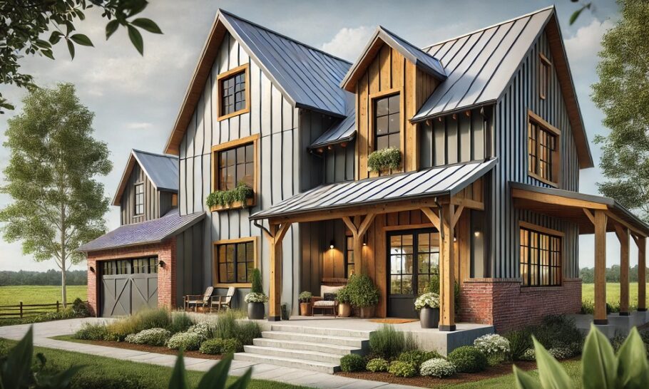
There is no denying the universal appeal of the barndominum. Its blend of rustic, industrial architecture with the comfort of a modern home has captured the imagination of homeowners across the country. But with the rise in popularity comes a bit of a design rut. Walk through enough “Barndo” tours online, and you’ll start to notice a theme: white walls, gray floors, and black fixtures.
Don’t get me wrong—the modern farmhouse neutral palette is clean, crisp, and safe. But if you are investing in a home with a massive open concept, soaring ceilings, and metal-clad exteriors, “safe” might not be in your vocabulary.
Your barndominium is a blank canvas of steel and wood. It begs for personality. If you are ready to ditch the greige and embrace something with a little more backbone, here are some barndominium color palettes that truly wow by going far beyond the expected neutrals.
The Philosophy of the “Barndo” Palette
Before we dive into specific colors, it helps to understand the architecture you are working with. A barndominium usually features large, uninterrupted wall spaces, exposed structural elements (like beams or purlins), and a lot of natural light.
Because of the scale, color doesn’t just sit on the walls here—it defines the atmosphere. You aren’t just painting a bedroom; you are painting a volume of space. This means you can afford to be bold. In fact, the architecture can handle it. Where a small city apartment might feel claustrophobic with a dark green, a barndominium with 20-foot ceilings will make that same green feel like a luxurious forest retreat.
1. The Moody Industrial: Iron Ore and Burnt Sienna
Let’s start by leaning into the “industrial” side of the barndominium. Instead of fighting the metal and concrete, amplify it. The moody industrial palette is for those who want their home to feel like a sophisticated loft rather than a rustic cabin.
The anchor here is a deep, dark gray-green like Iron Ore or a proper Charcoal Slate. This isn’t a soft gray; it’s a color that almost reads as black in low light but reveals complex undertones when the sun hits it. You put this on your lower walls or, if you are really brave, on the ceiling of a living room.
Pair this darkness with Burnt Sienna. This could be in the form of leather furniture, rusted metal artwork, or actual rusted metal cladding on a kitchen island. The orange-brown tone of the sienna pops against the deep gray, mimicking the look of industrial steel allowed to patina over time.
Where to use it:
- Lower walls: Use the dark gray on the bottom half of the wall in a great room to ground the space.
- Kitchen island: Fabricate the island in raw or rusted steel to bring the Burnt Sienna into the heart of the home.
- Accents: Look for light fixtures in antique brass or oil-rubbed bronze that have a warm, almost amber glow to bridge the gap between the cool walls and the warm rust tones.
2. The Desert Dweller: Adobe Dust and Prickly Pear
If your barndominium is sitting on a wide-open plot in Texas, Arizona, or New Mexico, why try to force a Pacific Northwest vibe? Embrace the landscape. The desert palette is all about sun-baked earth and the surprising pops of color found in the native flora.
Forget the stark whites. Instead, wash your walls in Adobe Dust. This is a pinky-beige, a terracotta light, or a warm sand. It changes with the sun, looking almost peach at dawn and a soft tan at noon. It is a natural, organic color that makes the interior of your steel building feel like it was carved out of the hillside.
Now, for the “Wow.” Introduce Prickly Pear. This is a saturated magenta, fuchsia, or deep cactus-flower pink. It sounds wild, but against the adobe backdrop, it looks like it belongs there. Use it sparingly but intentionally.
Where to use it:
- An entire accent wall: In a hallway or entry, a blast of this pink/magenta creates an instant art piece.
- Upholstery: A massive Prickly Pear velvet sofa in the middle of a room with Adobe walls is a power move.
- Tiles: Use a colorful, patterned cement tile in the mudroom or bathroom that incorporates these pinks and terracotta tones.
3. The Forest Canopy: Sagebrush and Douglas Fir
We see a lot of “greenery” in modern design, but it is usually a very washed-out, barely-there green. The Forest Canopy palette goes deep. It brings the outdoors in by mimicking the layers of a forest: the light undergrowth and the dark, sturdy trees.
Start with a base of Sagebrush. This is a softer, slightly gray-green that is perfect for large living areas. It is calm, natural, and easy to live with. It’s still a “neutral” in the sense that it won’t fight you, but it has far more soul than beige.
The magic happens when you introduce Douglas Fir. This is a very dark, true green—the color of a pine tree in the shade. Use this on cabinetry, on a built-in bookshelf that spans the height of your great room, or on the trim around massive windows.
Where to use it:
- Kitchen cabinets: Lower cabinets in Douglas Fir, upper cabinets in Sagebrush. It creates a rooted, grounded feel in the kitchen.
- Window trim: Painting the window frames in dark green makes the glass disappear and frames your view of the actual outdoors like a living painting.
- The “Barn Door”: If you have a sliding barn door, paint it in the deep green. It becomes a focal point without being a cliché.
4. The Nautical Rustic: Stormy Blue and Rope
Blue is a common color, but the typical “beachy” blue is too light and airy for the ruggedness of a barndominium. We need a blue that has some grit. Enter the Nautical Rustic palette.
The hero here is Stormy Blue. Think of the ocean right before a rainstorm—a deep, slatey blue with a hint of gray. It is moody, strong, and sophisticated. This color is stunning on exterior metal siding if your HOA or local taste allows it, but it is equally impactful inside.
Pair this deep blue with Rope. Rope isn’t a color you buy in a can; it is the texture and tone of natural fibers. Jute rugs, hemp curtains, sisal textures, and light oak wood tones. The contrast between the deep, saturated blue and the light, airy, natural fibers keeps the room from feeling like a cave.
Where to use it:
- Exterior siding: A deep blue barndo with a standing seam metal roof in charcoal is a head-turner.
- Bathroom vanity: In a bathroom, Stormy Blue vanity cabinets against a floor-to-ceiling jute rug or natural stone tiles feel spa-like and rugged.
- Bedroom accent: Paint the wall behind the bed in Stormy Blue. Use linens in crisp white and natural linen to keep it fresh.
5. The Urban Dweller: Charcoal and Millennial Pink
This palette is for the barndominium that sits closer to the city or the owner who wants an edge of modern trend without it being overwhelming. It is a sophisticated, slightly unexpected pairing that works beautifully with the straight lines of barndo architecture.
Charcoal is your primary. We aren’t talking about a flat black, but a deep, matte charcoal on the walls. This creates a “cocoon” effect. In a massive space, dark walls actually make the room feel more intimate and curated rather than like a warehouse.
Then, you soften the blow with Millennial Pink. But let’s call it “Dusty Rose” to make it feel a bit more classic. This is not a little girl’s bubblegum pink. It is a pink with brown and gray undertones—it looks sophisticated, almost like the color of a clay pot or a faded desert rock.
Where to use it:
- Upholstery: A large, plush sectional in a dusty rose velvet. It is soft to the touch and soft on the eyes, providing a sensory contrast to the hard metal and concrete elements of the home.
- Art and textiles: A massive abstract painting incorporating the pink and charcoal, or throw pillows that bring the pink up off the sofa and onto the dark walls.
- The kitchen backsplash: If you are using tile, find a zellige tile that has variations of dusty pink and gray. It will catch the light and add depth to a charcoal kitchen.
Making the Leap: How to Commit to Color
Switching from a neutral palette to something like “Moody Industrial” or “Desert Dweller” can feel intimidating. Here are a few tips to help you commit without the panic:
- Consider the Light
A deep blue or green needs light to look its best. In a barndominium, you likely have plenty of windows and high ceilings. Test your colors on different walls and observe them at different times of the day. That Douglas Fir might look black in the morning and brilliantly green in the afternoon sun. - Respect the Metal
Your barndo has metal elements—exterior siding, interior beams, or ductwork. When choosing a palette, look at the fixed elements first. Do you have galvanized steel? Warm wood? Black beams? Pull your color palette from those fixed items. If your beams are raw wood with orange undertones, the Burnt Sienna palette will look intentional. If your metal is cool and galvanized, the Stormy Blue palette will harmonize. - Use the “60-30-10” Rule
- 60% is your dominant color (the wall color—like Adobe Dust or Charcoal).
- 30% is your secondary color (the upholstery or cabinetry—like Sagebrush or Rope).
- 10% is your pop color (the accent—like Prickly Pear or Millennial Pink).
This keeps the bold choices feeling balanced and designed rather than chaotic.
Final Thoughts
Your barndominium is a unique blend of rural practicality and modern living. It is a structure that stands for something different. So, why would you paint it the same color as every suburban split-level?
By moving beyond the safe neutrals and embracing palettes that have personality—whether that’s the rust of an industrial loft, the magenta of a desert bloom, or the deep green of a forest—you turn your barndominium from a “house” into a “home.” You create a space that reflects the landscape outside your window and the personality inside your head. Go bold. The barndo can take it.